First Steps
As we enter into the beginning stages of constructing our own website, we reach the element of this project by which I’ve been the most intimidated. Having never created an entire website by myself before, it seems like a daunting undertaking. I have, however, begun looking at other websites for inspiration. After going through several different sites, I’ve found a few in particular whose features caught my eye.
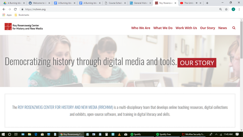
The Roy Rosenzweig Center for History and New Media

The Roy Rosenzweig Center for History and New Media’s website was by far my favorite of the ones I explored, and the site I plan to use for our “Annotate a Website” assignment. They had several desirable features, including a direct internal link on their homepage which lead to an “about us” style section. The link to their creative commons license is also very helpful.
I love that their projects are organized into block-shaped links with images attached. Not only does this format make the page look clean-cut and neat, but it also makes projects easy to find. Their “who we are” page is really well organized, although Avery and I won’t need something that complex since it’s just the two of us running our site and not a full staff. The sidebar with different categories could also be a feature to consider when constructing our site. While I loved the site as whole, there were a few features I would not want to replicate. The upcoming events/news blocks, for instance, are cool and useful, but would not necessarily be something I’d incorporate into our website. I would also want to put the contact information in a more visible spot, possibly in the “about us” section. The link to the homepage on the homepage also seems unnecessary. In general, however, I think the RRCHNM presents a solid model for us to look to when outlining our own site.
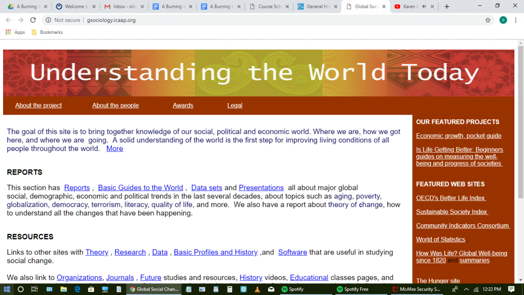
Understanding the World Today

I also looked at the website entitled Understanding the World Today. Understanding the World Today has a much simpler format than the RRCHNM’s website, but I do like that they clearly explain the intent of the site on the homepage. I also like their links to social media, although we don’t have any coordinating social media accounts to connect to our site. We could, however, include our individual blogs, which would be an interesting option. The stats counter reminded me of making websites on freewebs as a child, but it is a fun little feature. I still probably wouldn’t want to add it to our website, but I enjoyed seeing it here.
I think the “featured websites” sidebar is a nice touch, but I would probably put it on a different page rather than display it one of the first things someone visiting the site may notice. Much like the RRCHNM creative commons/general citation info page, I find the Understanding the World Today legal page incredibly useful. I think having a similar page on our website would be helpful for ourselves as a guide and for our visitors.
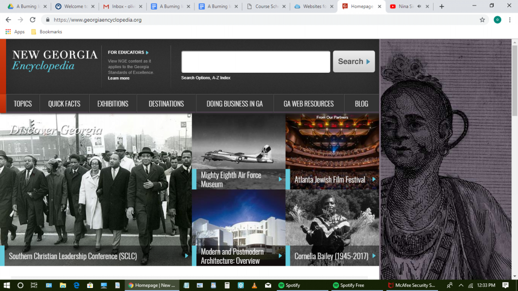
The New Georgia Encyclopedia

I like the general format of the New Georgia Encyclopedia’s website, but I would prefer if it were centered or took up the whole page, rather than having the side image which is interesting but provides no additional information for the visitor. The block links like the ones on RRCHNM’s site are still my favorite feature of the websites I’ve viewed. They keep the format clean but interesting, and add an interactive element to the page. I also like how the individual entries are formatted. They have a textbook-esque division which I find visually appealing and easy to read.
The search bar is visibly displayed at the top of the page, and gives the option to filter results, which is a nice touch. I don’t know how we would replicate this feature on our site, but if we can I would like to have some sort of search feature.